Grids Part 1: To grid or not to grid
In my day-to-day work, I find myself talking to a lot of people who have a lot of accessibility problems with different tables and grids. Grids are right up there with combobox woes and tooltip mishaps in causing an outsize amount of pain to developers who are trying to get accessibility right.
Part of this flood of grid accessibility questions might be caused by a quirk of where I happen to work, but I don't think that's the only reason tables and grids are over-represented in accessibility bugs. The semantics for tables and grids are relatively complex, and can unexpectedly break due to extra <div>s or CSS display values; grids can have some pretty complex keyboard interaction, and good accessibility documentation is scarce; the visual layout does not play well with mobile viewports or high levels of zoom; most out-of-the-box solutions for things like row selection, sorting, filtering, and virtualization break the screen reader experience. Actually, most out-of-the-box grid components out there have pretty poor accessibility across the board -- even the ones that claim otherwise. All of these combine to make it difficult to get tables and grids right.
So, partly for fun and partly in a futile attempt to reduce my daily email load, let's use a series of posts to take a deeper look at some of the ways tables and grids can go wrong:
- Using a grid when a table is needed, or vice versa
- Semantics and keyboard navigation
- Small viewports, zoom, and other visual accessibility issues
- Sorting and filtering
- Row selection
- Virtualization (i.e. loading rows on demand in a very large grid or table)
This first post is going to cover what should be the first question asked when creating a table or a grid, which is: should I be creating a table or grid?
What is a table, really?

The minimum requirement for both tables and grids is that they contain information whose structure is characterized by a two-dimensional relationship.
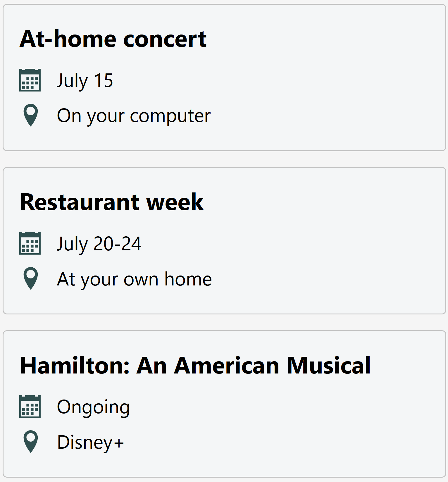
Since that's a bit of a mouthful, what I mean is that the information in each cell of a table gains additional context from its relationship to both a row and a column. For example, here are two different ways to present the same information, one of which delivers a two-dimensional relationship, and one does not:
Example 1:

Example 2:

The first example makes it easy for users to skim times and locations by organizing the information as tabular data, and the second example makes it easier to skim event titles by using a simpler list structure with headings. Both are valid choices, depending on what is deemed most important for a user in the context in which the events are displayed.
The important thing is that if a design decision is made to structure information as a table to surface column and row relationships, then it needs to be semantically marked up as a table to provide that same experience to screen reader users.
Here's another example of a good use of a table; in this case, the information would not be nearly as understandable in a list:

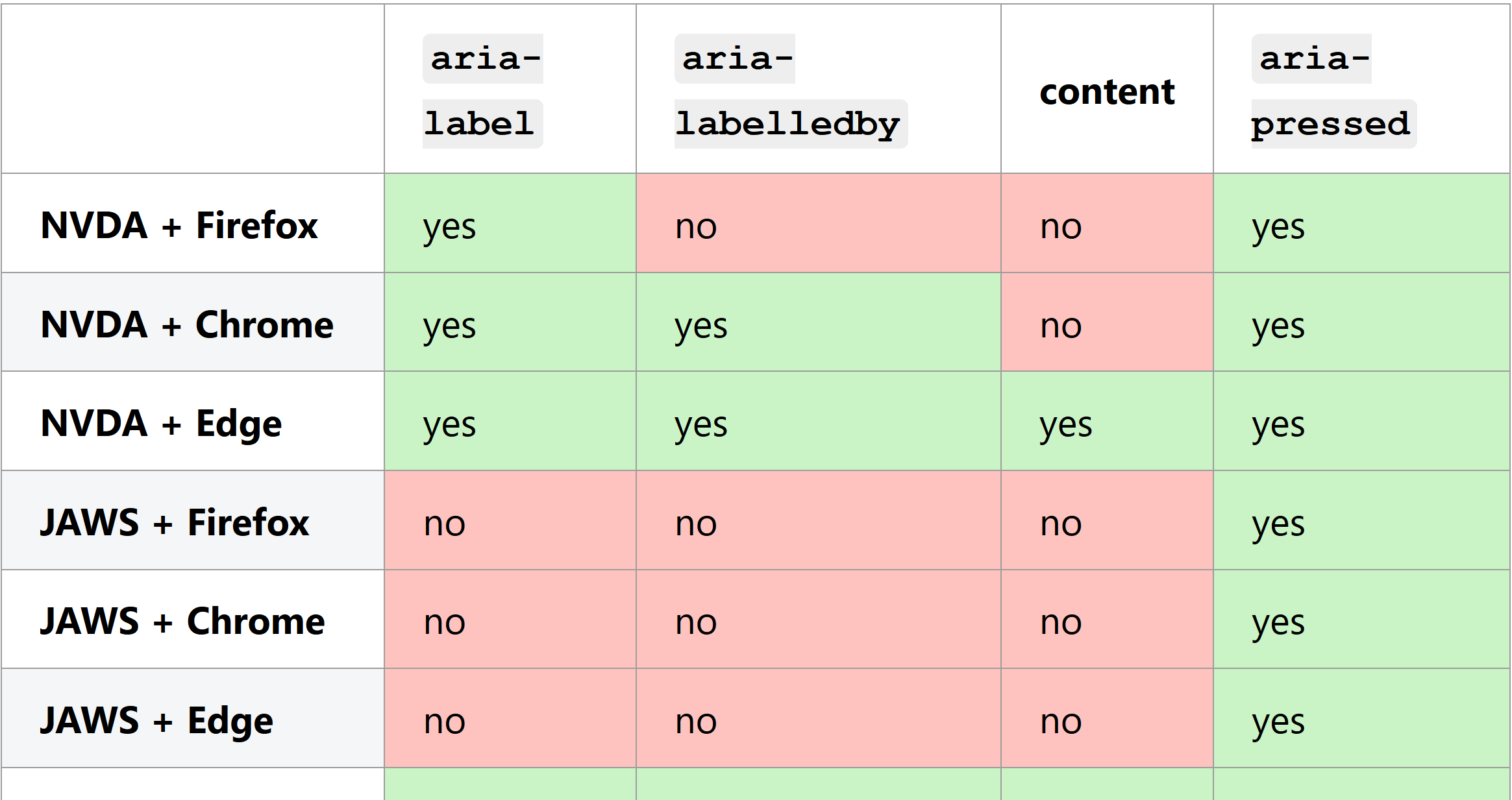
I've actually used tables on this blog previously to display browser and screen reader support information in the Playing with State article (this table has both column and row headers):

So, in essence: a table is a method of displaying information to enable the easy consumption of two-dimensional relationships within that information.
What is a Grid?
All of the requirements around two-dimensional information structure that apply to a table also apply to a grid, but with the addition of interactivity. Visually, tables and grids can look the same or very similar, and both should support consuming information in the same way.
Grids differ from tables in how they support interactivity: all cells are focusable and keyboard navigable, and the general idea is that many if not all of the cells will support some type of user action.
Possible user actions within a grid could include editing a cell value (common in a spreadsheet), selecting or deselecting a cell, and reordering, inserting, and deleting rows or columns. If most of the cells are not interactive, then it seems likely that a table would be a better choice than a grid.
Grids should also be a single stop in the tab order regardless of how many interactive elements they contain, since keyboard navigation is handled by the author by listening to arrow keys, home, end, page up, page down, etc. For that reason, keyboard navigation within a grid can be much more efficient than tabbing between focusable elements within a table.
These semantic and interaction differences between a table pattern and a grid pattern are only really relevant to keyboard and screen reader users; there is no meaningful change in visuals or pointer interaction when switching from one to the other.
An editable spreadsheet is a very straightforward use case for a grid. Sort of like an Excel-lite, like this spreadsheet for entering expenses:

The following example of a grid for managing virtual machines doesn't involve editing cell values, but does provide multiple actions per row:

There are even some pretty creative uses you can put to a grid, such as an online board game like bingo or chess. Cordelia McGee-Tubb explored this in her article about building an accessible bingo web app.
What is not a grid
Back in ye olde days of the web, before CSS flexbox and grid, tables were sometimes used for layout since they had excellent cross-browser support and made complex layouts relatively easy to code. This littered the web (and email inboxes) with semantic <table>s that did not contain tabular data, and created some pretty long-lived headaches for browser and screen reader vendors.
Luckily, those days are behind us, and now no developers ever misuse semantic HTML elements or ARIA roles.
coughs. What's that? That's not true? Ah well, guess I still need to finish this article and go to work tomorrow.
So what does misusing a grid look like in modern web development, now that layout tables are passé? Generally the not-grid grids I come across fall into two general categories:
- It's not all that interactive, and should probably be a table
- It's highly interactive, but not tabular data. It should be something else entirely.
Sometimes there seems to be the misconception that if a table has any interactivity, it must be a grid. Tables can be sortable, filterable, virtualized, and can contain links and buttons without needing to be a grid. We'll go a bit more into how to choose a table vs. a grid in the next section, but for now, remember: tables can be your friend too.
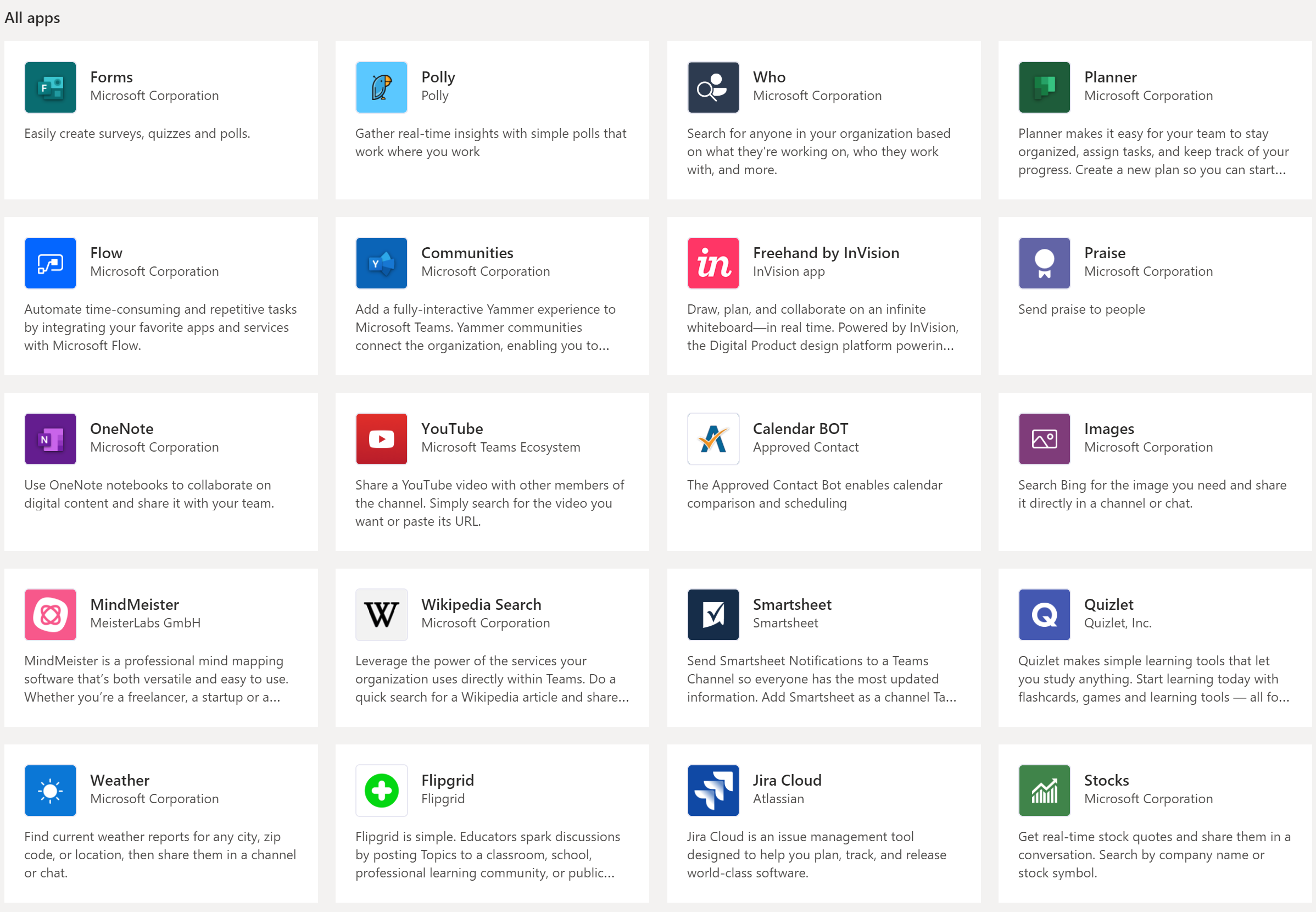
Highly interactive sets of items that do not have meaningful row and column relationships are also not grids. This is still true even if they are visually laid out in rows and columns, if those rows and columns do not provide meaning. A good example is this interface that allows users to pick from a list of apps: it is visually laid out in a grid pattern, but is not semantically a grid.

Then there's the unfortunate wording and example in the ARIA Authoring Practices about "layout grids" that seems to support this misuse. I'm not going to go into it because Adrian Roselli has already written an article about it, provocatively called ARIA Grid as an Anti-Pattern. Suffice it to say that the rationale seems pretty similar to the layout tables of yore: it identifies a pattern that is difficult to implement with the tools we have today, and then decides the best solution is to pretend that pattern is actually a table (or grid) (spoilers: it is not).
OK, now that I've burned that bridge, let's move on to the fun part --
When do you use a grid vs. a table, and why?
The examples above were all pretty straightforward: a data table with no interactive children should pretty clearly be a table, and an editable spreadsheet absolutely needs to be a grid. There's a fair amount of grey area in between, though. For example, before reading any further ask yourself whether you'd choose a table or a grid for each of these examples:
- A table of data primarily for reading, but each row has a few actions, e.g. view details / delete
- A table that is primarily static content, but with multiple links per row, and over 50 rows
- A table whose primary purpose is to select rows, but has otherwise static, read-only data
It's a bit of an unfair question, since both table and grid are valid answers to each of those cases, depending on other factors. I like to split those factors into two categories: purpose and context.
Purpose
Earlier, I mentioned that the number of interactive cells might indicate whether a table should be a grid or vice versa. That's not wrong, but there is no magic threshold where because you determine that more than 50% of cells are interactive, it must be a grid. Instead, I like to think about whether the primary purpose of the UI control is:
Reading:
If the primary purpose is for the user to consume and understand tabular information, then it leans towards being a table. This is true even if it contains many links or buttons.
Interacting:
If the primary purpose is to provide an interface for the user to edit, manipulate, or otherwise interact with the content it presents, then it leans towards being a grid. Even if most of the cells are static content.
Using this metric, the first two theoretical examples above (the data table with view/delete buttons, and the large table with multiple links) would lean towards being implemented as tables, and the third example (where the user is expected to select rows of static data) would lean towards being a grid.
Basing table vs. grid roles on primary purpose is more than just being pedantic about semantics. If a control is primarily intended to enable a user action or set of actions, it's more likely that a user will spend most of their time moving between and interacting with controls within the grid. In that case, efficiency in moving keyboard focus has a high priority.
If the primary purpose is consuming information, then a user is less likely to need to shift keyboard focus frequently, and simplicity and discoverability matter more than keyboard efficiency.
Context
Table and grid controls don't exist in a vacuum (unless you get so fed up you chuck your computer into space). The surrounding UI, the type of interface you're building, and the ecosystem it lives in will all contribute to user expectations.
For example, if you're building an admin interface for managing a store, you may find your app contains many highly interactive grids (inventory, employee management, finances, etc.). Then imagine a single view within that app contains a grid that is perhaps less interactive -- let's imagine a table of user accounts, each with a single "Edit" button.
Even if that example seems like a good fit for a table role when considered on its own, in context there's a strong case for using a grid to preserve consistency and predictability across the entire app.
Surrounding context is still important if the table or grid in question is the only control of its type. If the context is more like an app than a website in that it is highly interactive and uses other composite widgets like menus, tabs, and trees, then a grid is less likely to confuse a user. On the other hand, a lone grid on a typical restaurant website is much more likely to surprise and confuse people.
Use of a javascript framework like React or Angular, or client-side routing are not good indicators of app vs. website. Much like table vs. grid, web app vs. web site is all about whether the primary purpose is consuming static content, or enabling rich user interaction.
Another piece of context to examine is how long and how frequently your average user expects to interact with your interface. The more time an average user spends using a particular interface, the more they are likely to care about how quickly they can navigate it.
Grids have a steeper learning curve than tables and more support quirks across assistive tech, but they can also be significantly more efficient once learned (if built well). Table semantics have very robust support across screen readers and just about everyone knows how to mash the tab key, but a large table with many tab stops can really slow down keyboard-only navigation within it.
A web app for managing store data like the one imagined earlier would likely have users who visit daily, perhaps for years. Requiring users to spend some time learning how to use grids, trees, tabs, menus, and custom keyboard shortcuts is a reasonable choice in exchange for long-term efficiency. In an app like that, any table with a significant number of interactive elements could lean towards becoming a grid.
No one expects a rogue grid on your public-facing store website, though. Maybe make that a table, even if it has a lot of interactive children.
Also of note: just because Gmail, Excel Online, or an online tax software (to pick a random example that has nothing to do with my weekend plans) chooses to use a grid (or menu, tree, etc.), it does not mean the same choice makes sense elsewhere.
Conclusion
Tables and grids just want to be your friends, so long as you approach them for the right reasons.
Consider a table when:
- Displaying tabular data
- The primary purpose is for the user to read that data
- Discoverability and a low barrier to entry are more important than efficiency
- There are not too many interactive children, or the context is primarily other static content
Consider a grid when:
- Displaying tabular data
- The primary purpose is to enable user interaction
- Efficiency is more important than a low barrier to entry
- There are many interactive children, and the context is primarily interactive and app-like
And that's it on tables vs. grids! Next up is a more technical look at semantics and keyboard interaction within interactive grids.
Further reading
- Grid description in the APG (beware the "layout grid")
- Building an accessible bingo web app - Cordelia McGee-Tubb
- Hey, It’s Still OK to Use Tables and ARIA Grid As an Anti-Pattern - Adrian Roselli