 Sarah Higley
The web needs interactive lists
One of the priciples of creating new web platform features is "pave the cowpaths" -- figure out what cursèd UI developers and designers are already creating with third party HTML/CSS/JS, and brainstorm how to pull it into the web platform. Maybe with an exorcism or two to fix any particularly egregious accessibility problems.
When the same principle is applied to web accessibility specs, it generally means ensuring any widely used UI patterns can be marked up with an appropriate semantic pattern (i.e. roles and aria-* attributes) and documented interaction patterns that are understandable and operable across different devices, user settings, color modes, zoom levels, and assistive tech. Whether web developers actually do any of that is an entirely separate problem, but it should at least be possible.
Developers and designers will always create new innovative ways to be weird and inaccessible in their UI (intense side-eye at stuffing tabs and tables into comboboxes), and spec authors will always struggle to decide how far to support the chaos. However, every once in a while developers and designers create a perfectly normal, understandable, and theoretically accessible UI pattern that for whatever reason is not supported on the web.
One of those patterns is an interactive list.
What is an interactive list?
One way to think of an interactive list is as the one-dimensional version of a data grid. Just as a data grid is the interactive version of a table (i.e. <table> or role="table"), an interactive list would be the interactive version of a static list (i.e. <ul>, <ol>, or role="list").
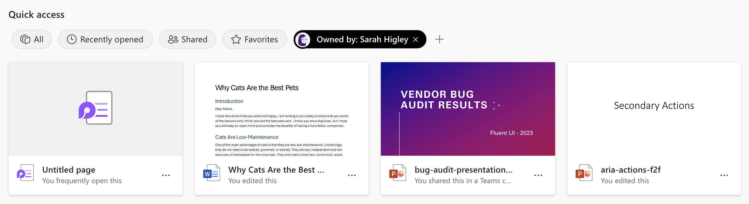
An interactive list, like a data grid, would be a single tab stop composite widget, where arrowing between list items would be expected. As such, it would more commonly be useful within interfaces that lean more towards web applications than content-focused websites.
Here are a few more concrete examples of UI where an interactive list role could benefit accessibility:
1. Navigation within an application.
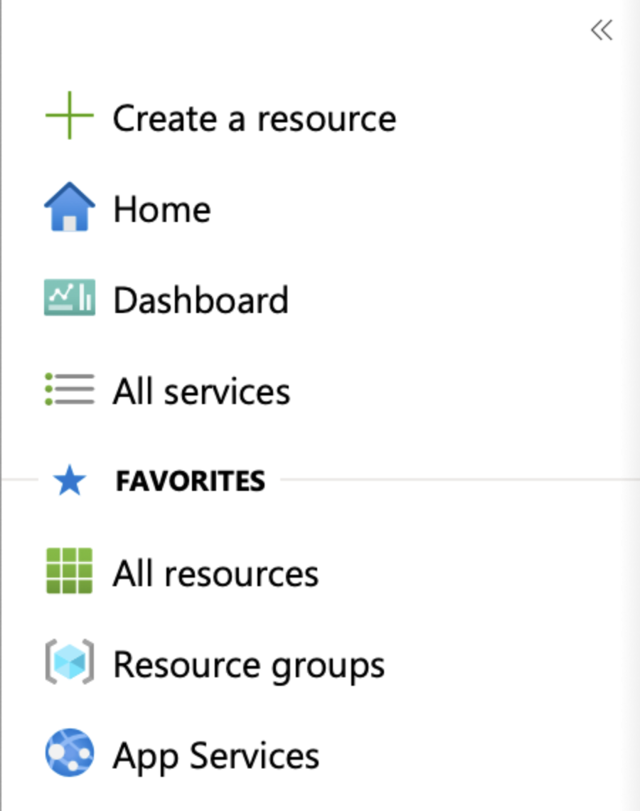
Normally navigation should be a simple, tabbable set of links, often in a static list. However in environments that function more like traditional desktop applications than websites (think email inboxes or Powerpoint online), it can be beneficial to have navigation be a single tab stop.
A tablist can sometimes be appropriate here, but an interactive list with child links would allow users to both arrow through items and also keep highly beneficial link functionality (e.g. using a screen reader's links dialog from anywhere in the app). Tablists also do not support static content like section/group headers, which often exists in navigation regions.
Multi-level navigation in apps like email inboxes sometimes use a tree, but nested lists of links can offer a significantly lower learning curve than a tree along with preserving virtual cursor access and use of the links dialog.
2. Chat messages
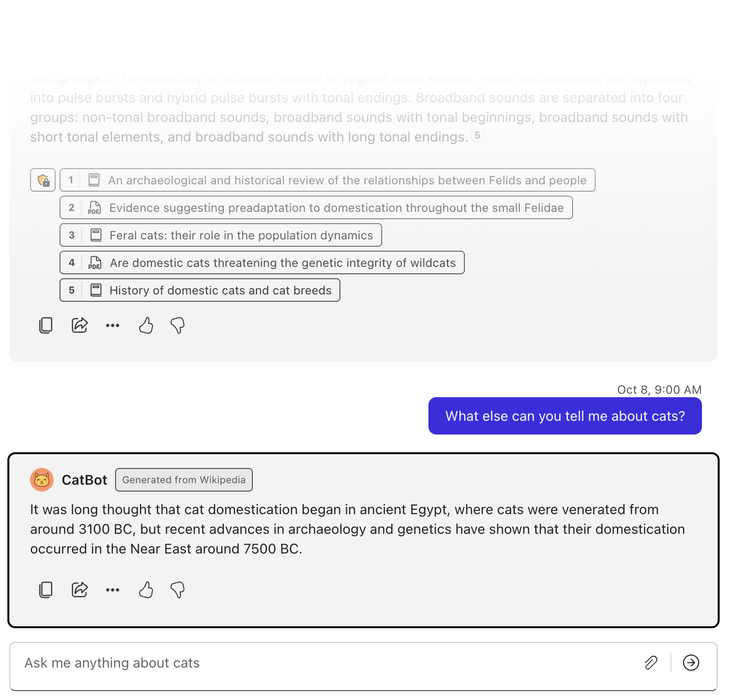
In this case, each individual chat message is usually not interactive in the sense that they do not have a single primary action and are not selectable. However, users should not need to tab through all content in a chat pane in order to reach the chat input. Most chat applications also allow users to arrow (and often use page down/page up to skip) through past messages.
3. Some carousels

Yes, everyone knows you shouldn't use a carousel. However, they continue to be built, and sometimes as in the case of streaming services, have become somewhat standard. Especially in UIs like this one from Netflix where there are many carousels in succession, users should be able to quickly tab to their desired category and then arrow through each item in that carousel.
The interactive list role wouldn't be appropriate for all carousels -- only ones similar to the pictured streaming service categories or other product carousels where each item has a primary action, and the context calls for arrowing between items. As with most accessibility choices, there is no one-size-fits-all.
4. File navigators and other lists of actionable items
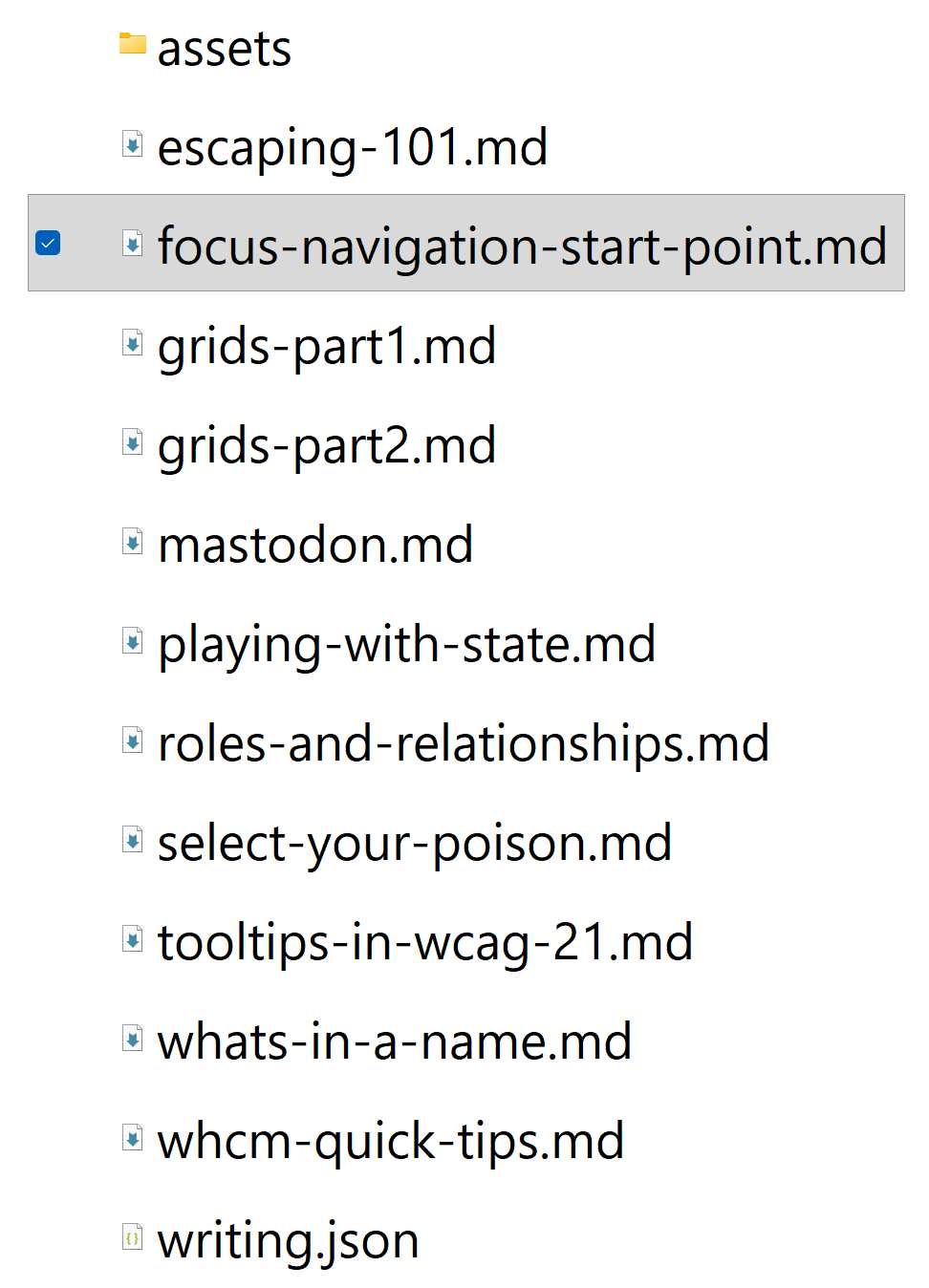
This applies not just to lists of files, but any other list of items where each item does one primary action. While listbox is a tempting role to reach for here, it is not ideal for several reasons: it enforces a selected state on options, it does not robustly support virtual cursor navigation of options, and it does not support having a non-selection primary action.

This already exists in native UI
Windows, macOS, iOS, and Android all have native versions of an interactive list, which matters for two reasons: assistive tech users are already familiar with the paradigm and wouldn't need to learn anything new, and from a technical/spec perspective, accessibility API mappings already exist.
Native platforms already providing this UX pattern is also compelling evidence that there are valid use cases for interactive lists.
Semantics and interaction requirements
There are three places to reference when determining semantic requirements for interactive lists:
- Grid, as the only other composite widget pattern that allows flexible inner content (e.g. nested links, buttons, headings, lists, etc.).
- Static list, as the base semantic pattern.
- What kinds of interactive list-like controls people are creating in the wild (i.e. the cow paths).
At the most basic level, it should be possible to create a horizontal or vertical arrow-navigable set of interactive items that do some general action when pressed. This alone would be enough to create the Netflix-style carousel example from earlier.
We can also come up with a few more requirements just from referencing the examples above:
- Selection, such as that shown in the file list example, should be supported but not required (this is also how grids work). Both single-select or multiselect should be supported.
- Nested interactives should be allowed (also similar to grids). This would enable the navigation example (nested links), the chat example, the initial quick access file cards example with their more options button, and the github reviewers list with the re-request review button.
- Nested structural content such as headings, lists, even tables. This would support the chat example as well as the first quick access file card example where card headers/file names could potentially be marked up as headings.
- Virtual cursor navigation should work: in most of these examples but particularly the navigation, cards, and chat, many users may prefer to use virtual cursor to navigate and interact. That means it should be possible to both navigate the list's content and also activate list items themselves while using the virtual cursor mode in Windows screen readers.
In addition to the specific requirements above, basic features of both static lists and typical composite widgets should also be supported, such as:
- The list should convey its structure and relationships as the user interacts with list items (e.g. the total number of list items when you first enter, and index of the current list item).
- The keyboard interaction pattern for an interactive list should be a single tab stop with arrowing between list items.
- Windows screen readers with automatic mode switching should switch to focus mode when landing on an interactive list, similar to other composite widgets like grid or tablist.
Existing ARIA semantics cannot replicate an interactive list
ARIA already has a number of one-dimensional composite widget roles, but no combination of them can cover all the existing common use cases for interactive lists. Even in cases where you can hack together something with existing roles, there are shortcomings.
The existing somewhat list-like linear composite widget roles are: listbox, menu/menubar, radiogroup, tablist, and toolbar. Of those, radiogroup and listbox are both form controls specifically designed only for selection, which prevents usage for any control where the main click handler does a non-selection action. menu and menubar are intended only for application-style menus or context menus, and additionally do not support virtual cursor navigation across all screen readers (listbox has the same issue, for that matter). tablist is designed for swapping visible content in an associated tabpanel, and toolbar is slightly more flexible but still intended only for buttons and form controls that affect some associated area of the page.
None of those roles allow nested structured content or secondary interactive controls.
Some clever developers might think of simply using a static list and managing focus between listitems, but that approach will not correctly trigger mode switching for Windows screen readers, nor will it allow screen readers and voice control to directly trigger a click event on the list items, as they are spec'd as static container elements.
Adding interactive list to the web
Hopefully by now you've either gotten bored and left, or are convinced that we should have static lists on the web. The good news is that there's already work around making that happen, and you (the now super-informed reader of my pedantic blog post) can help!
There is an active proposal in ARIA to add interactive lists that will be discussed at the end of October 2026:
- The primary spec issue: #2036
- A writeup for the 2023 face-to-face meeting from Mario Batušić Proposal: Interactive Lists
- Another writeup for the 2023 face-to-face meeting from me, with proposed spec language: Interactive list proposal
- TBA: a PR for a
listviewrole that I'm including in this post as personal pressure to actually finish it soon (too bad spec'ing a new brain isn't an option 😭). Congrats if you finish reading this post before I finish the PR and replace this rambling bullet point with an actual link.
If added to ARIA, an interactive list can also easily be added to HTML by creating a new focusgroup token. This would make authoring as easy as doing:
<ul focusgroup="list">
  <li>Arrowing is fun</li>
  <li>But only where appropriate</li>
  <li>Like in application-style interfaces</li>
  <li>Let's not mess this up</li>
  <li>By doing things like using it for standard website navigation</li>
  <li>Pretty please</li>
</ul>
For anyone who has their own examples of UI that could be an interactive list, or can think of other features that I've missed, I will pay attention to responses on Bluesky between now and the discussion on October 26th. Commenting on the ARIA github issue also works.