Quick Tips for High Contrast Mode
Windows High Contrast Mode behavior can be a bit of a surprise if you haven't already spent time studying its ways. Unlike other operating system display modes that invert colors or set a dark mode flag, Windows High Contrast Mode (WHCM) completely overrides authored colors with user-set colors.
A mode like invert colors will take author-set colors and transform them, which allows something like an authored background change on hover to still happen, albeit with different colors than originally defined. WHCM, in contrast, will completely ignore the authored background color. Colors on websites viewed in WHCM are determined solely based on HTML element, CSS property, and certain states (e.g. disabled). While authors still control things like whether a border exists and outline width, the colors themselves will be overridden (at least without a high contrast mode media query, covered below).
WHCM also cares not for your ARIA roles, states, or properties. Screen readers will read a <a role="button"> as a button, but to WHCM it remains a link and receives link colors. Just as a role="button" will not apply the <button> element's default browser styles, it will also not affect WHCM styles.
If the heavy-handed nature of WHCM color overrides makes bugs seem daunting or out of your control, you're not alone. However, there are often very simple solutions to most high contrast mode issues:
1. Custom focus styles + a transparent outline
Windows High Contrast Mode wantonly ignores border or background color changes and box shadows. Both common of those common custom :focus styles will be invisible in WCHM. Luckily, if the default CSS outline property doesn't give you the visual effect you want for focus states, there's a very simple fix. Instead of overriding default browser focus styles with outline: none, make it transparent instead: outline 3px solid transparent. An example using the universal * selector might look like this:
*:focus {
  background-color: rebeccapurple;
  box-shadow: 0 0 4px 1px rebeccapurple;
  outline: 3px solid transparent;
}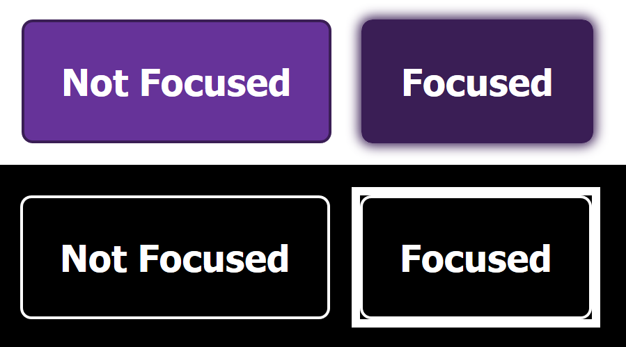
WHCM will override the transparent outline color, making it visible only when high contrast mode is turned on. This trick also works with transparent borders if, for example, your button has a distinct background color but no separately visible borders.
2. SVGs and currentColor
The SVG fill and stroke properties are exceptions to the rule that WHCM overrides all colors. SVG colors will be left as-is, which is great if the SVG is being used as a logo or general image, but less useful if it's intended to be a meaningful icon. This is where the CSS keyword currentColor comes in. currentColor is defined as the value for the text color property, which will be overridden by high contrast mode.
This is generally a great way to define SVG icon color if you want to make it match the surrounding text color, because then you don't need to define both color and fill separately, or separately update fill if the text color changes (e.g. on :hover). If you don't want the SVG to match the surrounding text, then you can define a unique color on the immediate parent of the SVG. Theoretically you could define color on the SVG itself, but this doesn't consistently get overridden correctly, while color on a non-SVG parent element will.
/* SVG icons within a link will be blue */
/* SVGs not in a link will be black */

body {
  color: #000;
}

a {
  color: blue;
}

svg {
  fill: currentColor;
}
3. CSS properties
The specific CSS properties used to style visual cues can make a huge difference in WHCM. For example, using only background-color to distinguish alternating rows on a table with no borders will work outside of high contrast mode, but disappear entirely within it.
Another example that comes up frequently is custom styled form controls. Sometimes UI like a text input is re-styled to remove borders and rely on a contrasting background color, or radio button and checkbox indicators are created entirely with CSS. There's no reason not to do this, but relying on either background color or transitions between different colors to indicate state can make entire components impossible to use in high contrast mode.
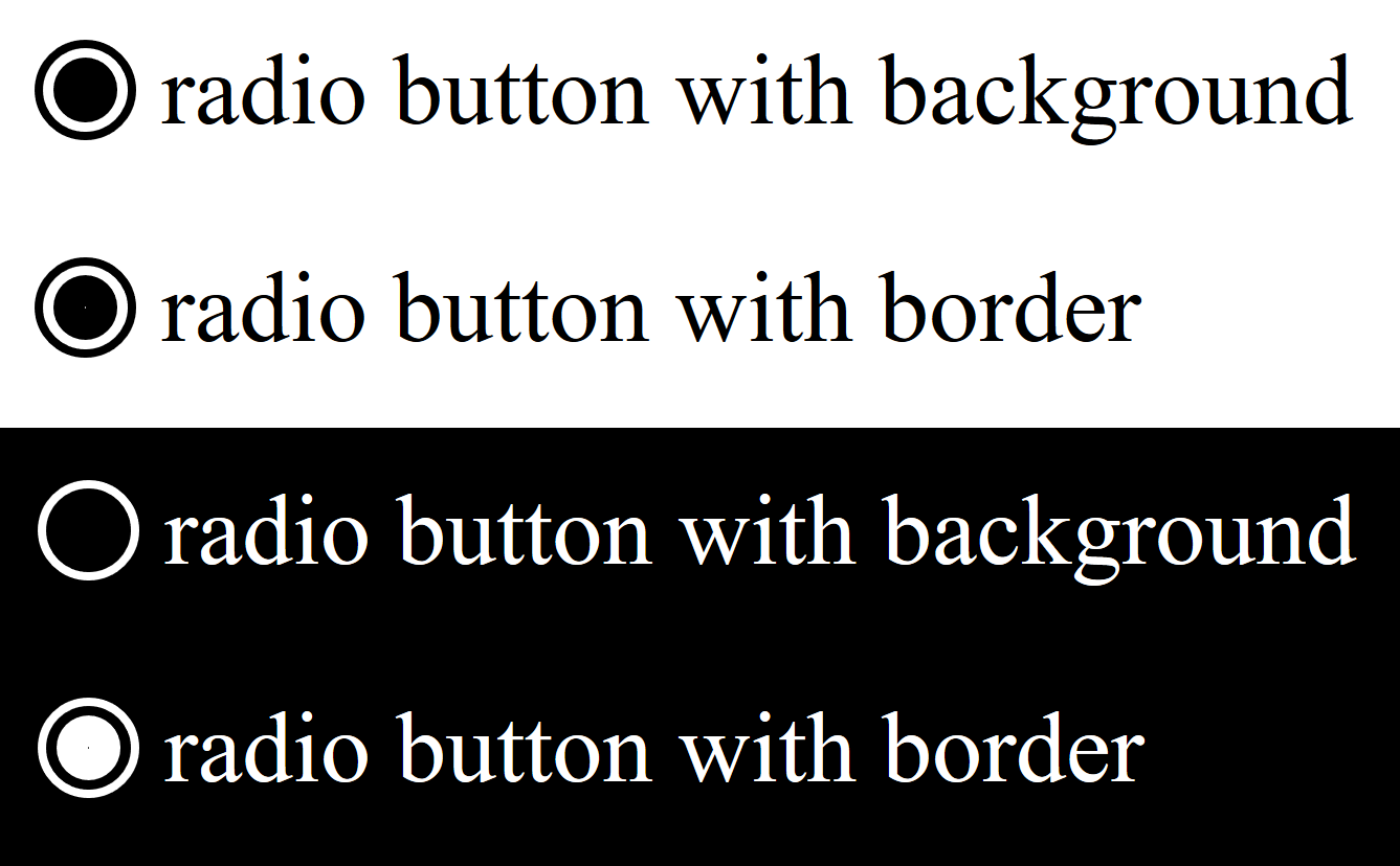
background-color, and the second uses border.Adding in a change in border or outline, or using SVGs instead, will result in accessible UI in both modes without impacting the experience outside of high contrast mode.
4. Media Queries
There is a media query that has traditionally allowed developers to target Windows High Contrast Mode and override its color modifications. This is the -ms-high-contrast media query, which supports targeting any use of high contrast mode, or specifically black-on-white or white-on-black. If using this, the best practice is to reference system color keywords rather than defining colors directly, so that the user's color choices will still be respected. This would let you do something like invert the foreground/background colors of a selected list item, or apply a visible box shadow on focus.
Rather than reproduce a full guide to using the -ms-high-contrast media query, I'd suggest reading Greg Whitworth's fantastic explainer, which includes both explanation and examples.
However, this technique comes with an enormous caveat: the -ms-high-contrast media query will be retired in favor of the standards-based forced-colors media query. Forced colors has the benefit of being CSS spec, with a cross-browser cross-OS set of standardized system color keywords.
As of writing, we're in an odd in-between time when -ms-high-contrast is on its way out, and forced-colors is still experimental. For now, the best approach is likely to not rely on a media query at all.
5. Browser testing
Edge, Internet Explorer, Firefox, and Chrome all support Windows High Contrast Mode, but not equally. Edge and Internet Explorer both support the -ms-high-contrast media query, and both will correctly map colors to user-set (or default) system colors. Firefox will adopt high contrast mode styles, but not fully respect system colors. Chrome does not adopt high contrast mode styles out of the box, but can be made to do so by going to chrome://flags/ and setting "Forced Colors: Enabled".
Based on media query support, correct system color mapping, and probable WHCM user base, Edge seems the best bet for Windows High Contrast Mode testing. As support shifts in the future, that will likely change to include other browsers as well.
Further Reading
All the links below are especially good this week (not that they usually aren't 😄). I'd particularly recommend Melanie's talk; she's done a bunch of work around the standardization of forced-colors, and is largely responsible for me knowing much of anything about high contrast media queries.
- Operating System and Browser Accessibility Display Modes - The A11y Project
- A great all-round HCM explainer - Adrian Roselli
- How to use -ms-high-contrast - Greg Whitworth
- Finessing forced colors (talk) - Melanie Richards
- MS Edge High Contrast explainer