forced-color-adjust: none is an unavoidable foot gun
Over the past seven (?!) years at Microsoft, high contrast styles have been a surprisingly consistent source of accessibility issues from partner teams. The surprise is because other common sources of bugs that bubble up to me tend to be either technically complex (e.g. live regions, focus management, assistive tech behavior), or theoretically complex (understanding semantics, assistive tech behavior). In contrast (heh), high contrast styles tend to be relatively simple and more easily understood by non-accessibility-focused devs since they involve relatively straightforward CSS.
There are two exceptions that cause non-trivial issues to arise:
- SVGs (written about more in Eric Bailey's article)
- Sprinkling
forced-color-adjust: nonethroughout a codebase like cloves in biryani. They may sometimes be helpful, but stumbling across one unexpectedly can make you gag.
This post is aimed at anyone working in an environment with multiple other developers or development teams while needing to maintain a codebase over time. If: you lovingly handcraft all your styles, and everyone who contributes is familiar with all CSS in the codebase, and this stays true both now and in perpetuity, then this probably won't be a problem.
However if you, like me, work in a large and chaotic system where code you write is copied, consumed, customized, and maintained away from your control by many other people, then it is a matter of when and not if a forced-color-adjust: none style will cause high contrast mode bugs.
The problem
By default, forced color modes work by converting UI from author-defined colors into a reduced palette of system colors based on HTML semantics, not authored CSS. Static text will adopt a CanvasText color against a Canvas background. Buttons will use ButtonText on ButtonFace, and disabled controls will have content and borders appear as GrayText.
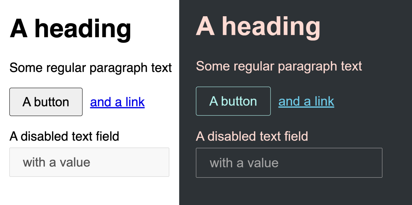
Even though this is how it works by default, it is still possible to override the default styles and customize forced color styles for both good and evil. There are a few ways to go about this:
-
Intentionally create transparent borders or outlines, knowing they'll only show up in forced colors mode. (This and some other tips are covered in my Quick Tips for High Contrast Mode article)
-
Using a forced colors mode media query, tweak styles using system color keywords:
@media (forced-colors: active) {
  .primary-button {
    border-color: Highlight;
  }
}
(note this only works with system color keywords, other colors will not be rendered without forced-color-adjust: none)
- Use a forced colors mode media query with
forced-color-adjust: noneto completely control colors, ideally still using system colors:
@media (forced-colors: active) {
  button[aria-pressed=true] {
    forced-color-adjust: none;
    background-color: Highlight;
    color: HighlightText;
  }
}
So the question you, a savvy reader, may already be asking is: if system color keywords work without needing forced-color-adjust: none, then why include it in that third example?
The reason is because of an unspec'd (unspecced? unspec'èd?) browser behavior: text backplates. In what appears to be a well-intended attempt to save authors from themselves, browsers render a solid-colored backplate to any text over a styled background (this happens with backgrounds on the same element or on ancestor elements). The color of this backplate is Canvas, regardless of the text color.
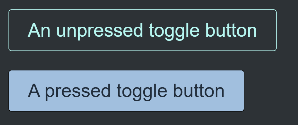
So if you want to have, for example, a toggle button that inverts colors when pressed, you might start with this CSS:
@media (forced-colors: active) {
  button[aria-pressed=true] {
    background-color: Highlight;
    color: HighlightText;
  }
}
And you would end up with this:

That cursed second button says "A pressed toggle button" for those of you who do not have perfect vision and did not press your eyeball against the screen.
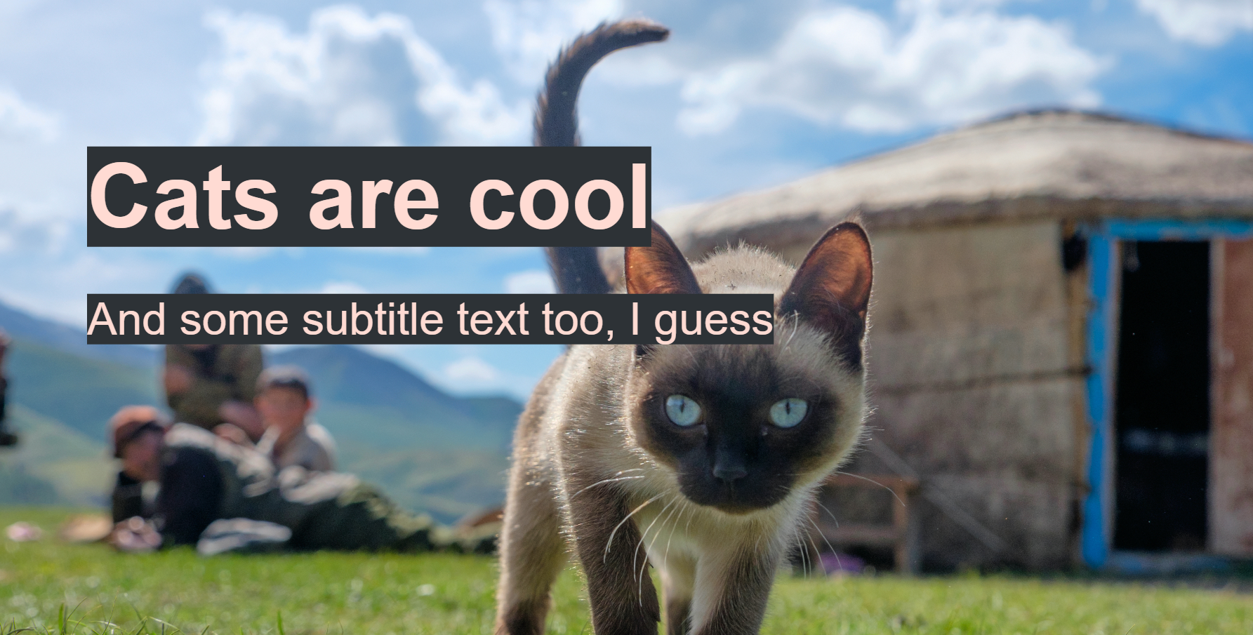
Adding a backplate does make sense and provide a safeguard for readability in some situations: text over images, for example:
However, adding a Canvas backplate for text that has an explicit (system) color style is risky at best, even more so when an explicit (system) background color was also provided. The use of system color keywords presumably in a forced-colors media query already implies a certain amount of intentionality from the author, so dealing with a text backplate often feels like fighting with the browser over who can deliver better colors to the user.
Additionally, the backplate is fully outside web authors' control, and the only thing we can do to fix it is add forced-color-adjust: none:
And then weep.
Wait, why are we crying?
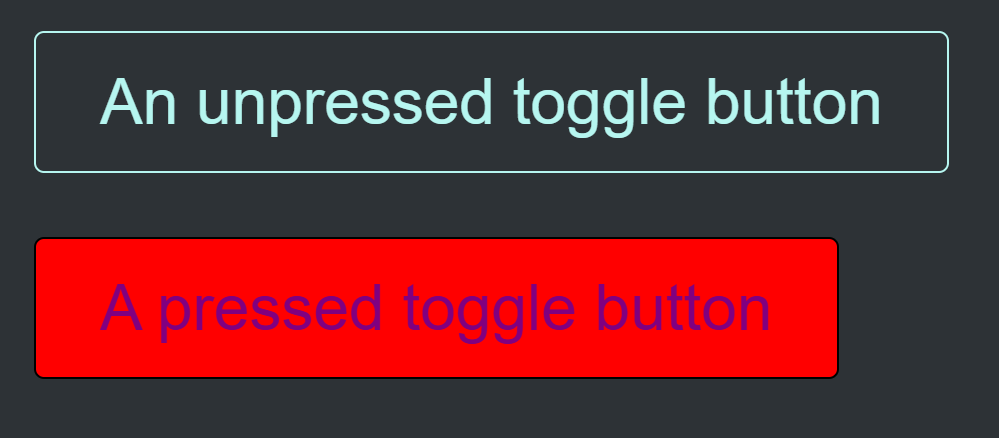
The problem with adding forced-color-adjust: none is that it allows all CSS-styled colors to come through on that element, not just system colors. So even if you (a responsible developer who cares enough about accessibility to have stumbled on this blog) craft beautifully accessible forced-colors CSS using only system color keywords, someone else may come along and unintentionally screw it up. Usually without ever knowing that they affected high contrast mode styles at all.
It looks a bit like this:
Your code: beautiful, lovely, perfect.
@media (forced-colors: active) {
  button[aria-pressed=true] {
    forced-color-adjust: none;
    background-color: Highlight;
    color: HighlightText;
  }
}
Their code: terrible. (But if we're being honest this is perfectly normal and reasonable)
.custom-button[aria-pressed=true] {
  background-color: red;
  color: purple;
}
Since the addition of a .custom-button class creates a higher specificity style, it overrides the original style even though it's outside a forced-colors media query and clearly not intended to affect high contrast mode. And because of the original forced-color-adjust: none, the random red and purple colors come through:
In a collaborative environment, someone somewhere will always take your code and extend or customize it. Often this involves writing styles with a higher specificity selector. Or even a same-specificity selector that comes after your CSS. None of the code involved is unusual or bad practice, which makes it all the worse that it trips up so spectacularly and unpredictably on forced-color-adjust: none.
Individual bugs are fixable, but the downstream CSS author has to manually re-add the forced-color styles back in. Which means the author of that code needs to be aware that this is necessary, even though they themselves never touched or directly overrode forced-colors styles:
.custom-button[aria-pressed=true] {
  background-color: red;
  color: purple;
}

@media (forced-colors: active) {
  .custom-button[aria-pressed=true] {
    background-color: Highlight;
    color: HighlightText;
  }
}
Authors are especially unlikely to realize when they need this, because most of the time they don't. And in practice, web authors should not need to be aware of this level of minutiae when making small style tweaks. If you're the unlucky schmuck maintaining this stuff, good luck trying to keep up-to-date documentation on which specific selectors will need forced-color styles re-asserted every time they are customized.
The library I work on consistently gets a trickle of high contrast questions from partner teams that are caused by variations of this issue. And those are just the ones that get caught. Changing the colors of a shared base control is the most common style customization out there, and every single use of forced-color-adjust: none is one CSS line away from breaking in high contrast.
OK I get it, I just won't use it
So if forced-color-adjust: none is a foot gun, is it possible to avoid it?
No.
Well, I suppose it could be possible for projects that have fairly simple controls and content, but usually no. Here is a reduced list of use cases for overriding colors off the top of my head:
- A primary button style to differentiate the primary action from secondary actions (e.g. for Save / Cancel buttons)
- The pressed state of a toggle button
- The selected date of a datepicker
- Many other selected item styles (tabs, options, rows in a grid, etc.)
- Highlighting the current page in a navigation section
Some of those could potentially use a design that doesn't rely on color at all (e.g. using a check icon to denote selection), but in practice at least sometimes you will need custom high contrast text colors. In theory, putting effort into high contrast styles is a good practice that can improve the user experience quite a bit, making it easier to identify buttons, selected items, and other visual cues at a glance.
In practice, doing so also makes the high contrast UX much more fragile and likely to break over time. And since this is accessibility, the bugs will likely go uncaught for a frustrating length of time as well.
So what should we do?
Cry. Drink. Drunk cry.
But really, it's still probably good to customize high contrast colors when needed, which means you'll need to use forced-color-adjust: none sometimes. Try to keep those instances both infrequent and tightly scoped. Never add forced-color-adjust at a higher level than you need to. And if it's only necessary in one state (e.g. hover or pressed), only add it to that state.
Perhaps someday text backplates will go away (at least for non-image backgrounds) and we can all stop using forced-color-adjust: none entirely. (Except for those weird instances like color pickers where you actually want it. Please don't @ me with your random good use cases, I know they exist.)