 Sarah Higley
Grids Part 2: Semantics
This is part 2 in a series about ARIA grids (not at all related to CSS grids 🙃)
In the first post of this grids series, I wrote that the defining feature of grids and tables is that they present two-dimensional relationships in a set of data. Or, put another way, they are designed to make it easy to skim both row and column relationships.
Row and column relationships are handled visually by lining up each cell horizontally with other cells in the same row, and vertically with other cells in the same column.
Screen readers present the same relationships non-visually with a number of different UX features that can vary by screen reader. These generally include:
- providing custom shortcuts to navigate by column or by row
- reading row- and column-header information when changing rows or columns
- reading row index and column index information
- providing a custom shortcut to read row- or column-headers on demand
Table and grid semantics boil down to creating a programmatic definition of row and column relationships. Screen readers are able to provide their table and grid experience only if the software can parse the row and column relationships that are conveyed visually.
Once more for emphasis:
Screen readers are able to provide their table and grid experience only if the software can parse the row and column relationships that are conveyed visually.
If a developer were to code a collection of plain <div>s to visually look like a table, the resulting non-visual experience would be a bit like if someone had Dali paint a grid, then gave that painting to you and told you that your job depended on you being able to read it.

Structural table and grid semantics
The foundation of table semantics is creating a relationship between cells in the same row, and between cells in the same column. This can only be done with good HTML structure.
In order for a visual row of cells to also behave like a row for screen readers, those cells must all be children of the same row. And in order for a visual column of cells to also behave like a column, they must all have the same child index within their parent row.
Sometimes legacy code or some outside requirement means that you end up working with a less-than-perfect DOM structure. Maybe you’re stuck using <div>s, and there happen to be too many of them. That particular problem -- too many extra elements -- can be fixed, but out-of-order cells or incorrect groupings can only be fixed by re-ordering the HTML.
ARIA can help prune extra non-table nodes from the accessibility tree and it can change what a screen reader says when it encounters a specific cell, but only the structure of the HTML itself can enable necessary screen reader interactions and shortcuts within a table.
Practical Example 1: non-table nodes
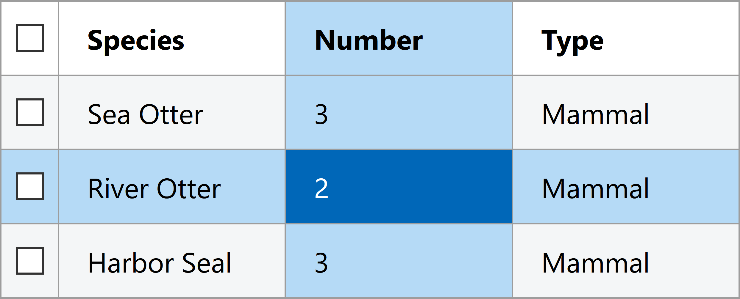
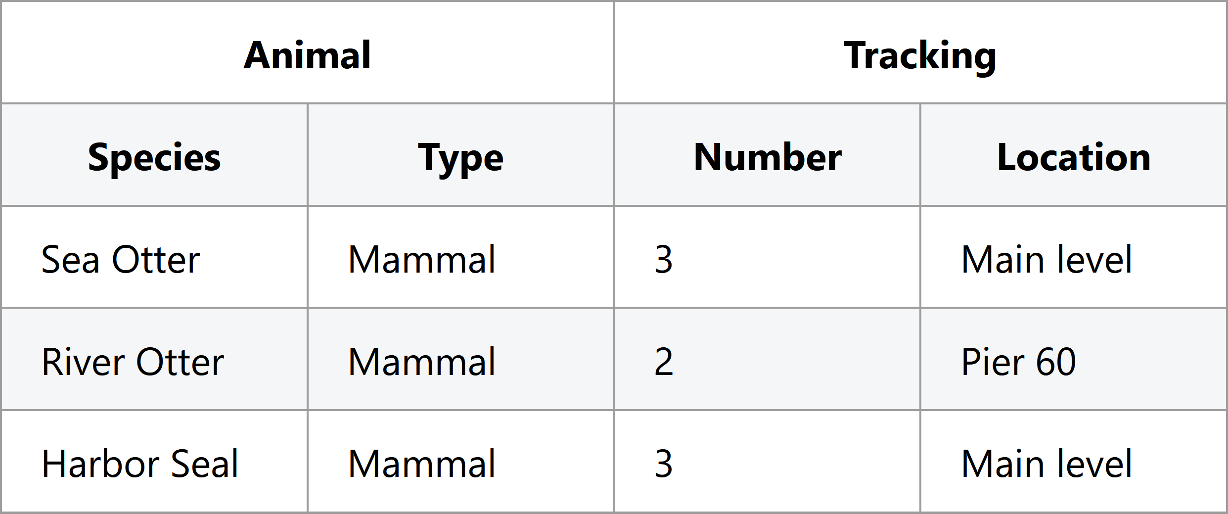
Here is some sample table code that includes both extra non-table elements and checkboxes outside of grid cells that illustrates what I’m talking about. This particular example uses ARIA semantics rather than <table> elements to demonstrate the effect of improper table structure. Don't worry too much about the specific roles right now; we'll cover those later.
<div role="table" aria-label="Animals at the Seattle Aquarium">
  <div role="row">
    <input type="checkbox" class="row-selection" aria-label="select all rows">
    <div role="columnheader">Animal type</div>
    <div role="columnheader">Number</div>
  </div>
  <div role="row">
    <input type="checkbox" class="row-selection" aria-label="select sea otter row">
    <section class="animal-cell">
      <div role="cell">Sea Otter</div>
    </section>
    <div role="cell">3</div>
  </div>
  <div role="row">
    <input type="checkbox" class="row-selection" aria-label="select river otter row">
    <section class="animal-cell">
      <div role="cell">River Otter</div>
    </section>
    <div role="cell">2</div>
  </div>
  <div role="row">
    <input type="checkbox" class="row-selection" aria-label="select harbor seal row">
    <section class="animal-cell">
      <div role="cell">Harbor Seal</div>
    </section>
    <div role="cell">3</div>
  </div>
</div>
If you run NVDA on this table markup in Firefox, it chokes in two separate ways:
- on the checkbox that exists outside of a cell
- on the extra
<section>elements.
See if you can catch both problems in this video, or by directly testing the examples page.
Different browsers do different amounts of error correction for authoring errors in table markup, so trying this same markup in a different browser and screen reader pairing may get you different results. If a table works fine in one screen reader but fails in another, it might be a screen reader or browser bug, but it might also be a problem with the markup.
The best way to ensure every screen reader’s table UX works properly is to construct a clean accessibility tree. I wrote about using role="presentation" or role="none" to fix the accessibility tree of composite widgets like tables and grids in a previous blog post, Roles and Relationships.
Right now, the accessibility tree for that table code looks like this:
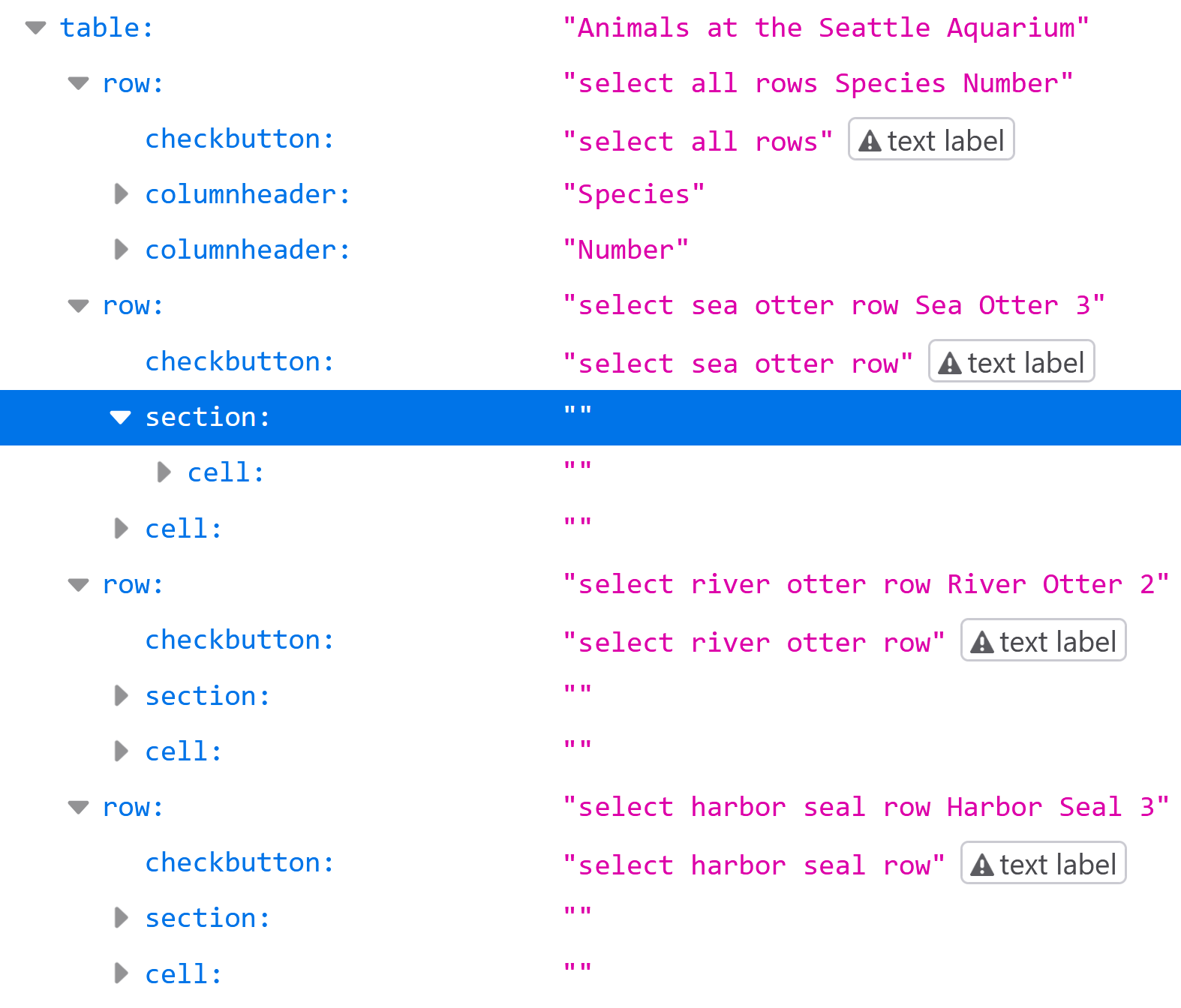
If we apply role="presentation" to all the <section> elements, we end up with this accessibility tree:
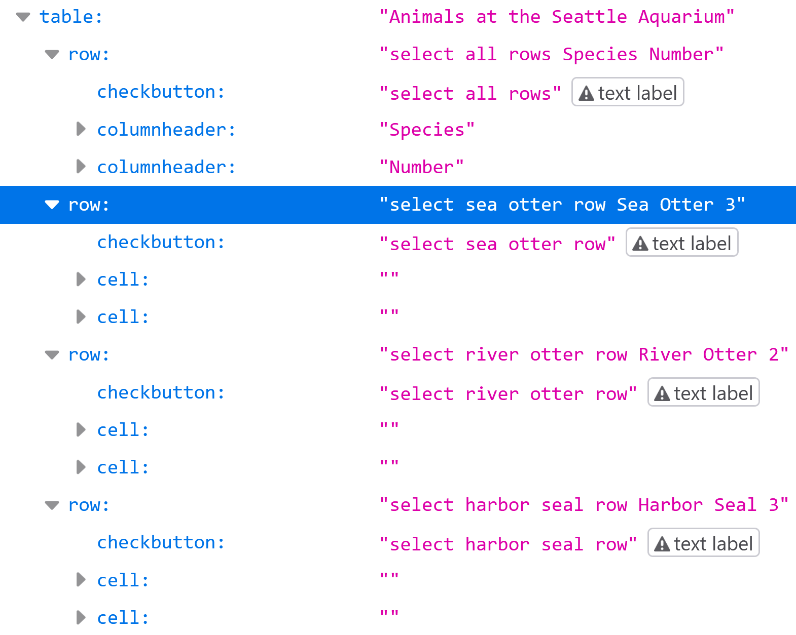
There's still one problem: the checkboxes are still not reachable with table navigation, since they're not within a table cell. When creating tables and grids, all content must be contained within the cells. To fix that, we need to wrap the checkbox in an element with role="cell":
<div role="table" aria-label="Animals at the Seattle Aquarium">
  <div role="row">
    <div role="columnheader">
      <input type="checkbox" class="row-selection" aria-label="select all rows">
    </div>
    <div role="columnheader">Animal type</div>
    <div role="columnheader">Number</div>
  </div>
  <div role="row">
    <div role="cell">
      <input type="checkbox" class="row-selection" aria-label="select sea otter row">
    </div>
    <section class="animal-cell" role="presentation">
      <div role="cell">Sea Otter</div>
    </section>
    <div role="cell">3</div>
  </div>
  <div role="row">
    <div role="cell">
      <input type="checkbox" class="row-selection" aria-label="select river otter row">
    </div>
    <section class="animal-cell" role="presentation">
      <div role="cell">River Otter</div>
    </section>
    <div role="cell">2</div>
  </div>
  <div role="row">
    <div role="cell">
      <input type="checkbox" class="row-selection" aria-label="select harbor seal row">
    </div>
    <section class="animal-cell" role="presentation">
      <div role="cell">Harbor Seal</div>
    </section>
    <div role="cell">3</div>
  </div>
</div>
And that's all that's needed to fix the table's accessibility tree so that screen readers can navigate through rows and columns, and properly associate cells with their column headers.
ARIA table and grid roles
Tables
The previous example showed the role hierarchy needed to build a table with ARIA. There are roughly two reasons you might need to use ARIA roles to construct a semantic table:
- For whatever reason, you cannot use HTML
<table>elements - You use HTML table elements, but you need to override the table's CSS display property.
In both cases, you would need to explicitly declare table semantics with ARIA for them to be recognized by screen readers.
The available ARIA roles for tables are these:
table: the top-level container role, equivalent to the<table>elementrowgroup(optional): can denote a related group of rows, equivalent to the<thead>and<tbody>elementsrow: groups cells into rows, equivalent to the<tr>elementcolumnheader: used to create a header cell that labels all body cells within the same column, equivalent to<th scope="col">rowheader: used to create a header cell that labels all cells within the same row, equivalent to<th scope="row">cell: all table content must be in one of these, equivalent to the<td>element
If you use semantic HTML table elements and do not override the CSS display property of any of them, then you do not need to use any ARIA roles.
Grids
Grid semantics differ slightly from table semantics, and always need to be explicitly declared. I went over why you might want grid semantics vs. table semantics in the first post in the grid series. Assuming you do, in fact, need a grid, these are the available ARIA roles:
grid: the top-level container rolerowgroup(optional): can denote a related group of rows, equivalent to the<thead>and<tbody>elementsrow: groups cells into rows, equivalent to the<tr>elementcolumnheader: used to create a header cell that labels all body cells within the same column, equivalent to<th scope="col">rowheader: used to create a header cell that labels all cells within the same row, equivalent to<th scope="row">gridcell: all grid content must be in one of these, equivalent to a<td>within a grid
You may already have noticed that these are identical to the ARIA table roles, with the exception of grid and gridcell.
The easiest way to create a grid is to use HTML table elements, and add role="grid" to the top-level <table>. No other roles are needed if the table is otherwise semantically correct and the CSS display properties are not overridden.
If that is not the case, all other roles must also be explicitly declared, just as with table semantics. Using rowgroup is optional for both tables and grids, and can be used to group header rows vs. body rows. It can also be used to group related rows within the table or grid body.
A quick note on CSS display properties
Despite their names, the CSS display: table and display: grid styles are not related to ARIA table and grid semantics, and do not (or should not) create table and grid nodes in the accessibility tree.
I've also mentioned above that overriding the default CSS display of table elements (including <tr> and <td> elements) will remove their default semantics. Adrian Roselli's CSS display properties vs. HTML semantics and Steve Faulkner's Short note on what CSS display properties do to table semantics include more specifics on how that happens. The TL:DR; is if you do this, you need to use all the ARIA table or grid roles instead of relying on HTML to handle screen reader accessibility by default.
Supplementary table and grid semantics
Lazy-loading rows or columns
There are four ARIA attributes available for both tables and grids that can be extremely useful if you are lazy-loading rows in a very large table or grid. For example, you could have a table that contains 500 rows total, but you only render 25 in the DOM at any given time to improve performance. If you do this without using ARIA, a screen reader will always announce the rendered rows as 1-25 out of 25, even if the user is really on rows 150-175 out of 500.
To fix this, you can use these two properties:
aria-rowcount="500"on the<table>orrole="table/grid"elementaria-rowindexon each<tr>orrole="row"element.
If you lazy-load columns as well as rows, you can use these properties as well:
aria-colcounton the<table>orrole="table/grid"elementaria-colindexon each<td>orrole="cell/gridcell"element
None of these attributes are necessary if all the rows and columns are present in the DOM at all times. They also are not necessary if your grid has multiple pages, but does not dynamically load content by scrolling.
Practical example 2: out-of-order rows
It is possible to use CSS to style elements to visually appear in a different order than they are defined in the DOM. You can brute-force this with position: absolute;, or use reordering options that come with display: grid; and display: flex;.
Screen readers do not follow the visual order, and will always rely on DOM order, which translates to the order in the accessibility tree. This holds true for tables and grids, despite the aria-rowindex and aria-colindex properties.
To illustrate, let's add some aria-rowindex and aria-rowcount properties to the table from earlier, and style so the visual order matches the declared aria-rowindex order. Here is the HTML:
<div role="table" aria-label="Animals at the Seattle Aquarium" aria-rowcount="100">
  <div role="row" aria-rowindex="5">
    <div role="columnheader">
      <input type="checkbox" class="row-selection" aria-label="select all rows">
    </div>
    <div role="columnheader">Animal type</div>
    <div role="columnheader">Number</div>
  </div>
  <div role="row" aria-rowindex="7">
    <div role="cell">
      <input type="checkbox" class="row-selection" aria-label="select sea otter row">
    </div>
    <div role="cell">River Otter</div>
    <div role="cell">2</div>
  </div>
  <div role="row" aria-rowindex="6">
    <div role="cell">
      <input type="checkbox" class="row-selection" aria-label="select river otter row">
    </div>
    <div role="cell">Sea Otter</div>
    <div role="cell">3</div>
  </div>
  <div role="row" aria-rowindex="8">
    <div role="cell">
      <input type="checkbox" class="row-selection" aria-label="select harbor seal row">
    </div>
    <div role="cell">Harbor Seal</div>
    <div role="cell">3</div>
  </div>
</div>
And here is how NVDA treats it:
The most important takeaway here is the aria-rowcount, aria-rowindex, aria-colcount, and aria-colindex properties will affect what a screen reader says when encountering a specific element, but will not change any other behavior or navigation. This is also generally true of most ARIA states and properties.
I realize this example may seem fairly contrived, but there is at least one major grid library out there that handles lazy-loading by re-using and visually re-ordering the DOM elements used for rows as the user scrolls through the grid. The result is the visual order does not match the DOM order, and the screen reader accessibility is entirely broken.
Accessible lazy-loaded content takes more than just these four ARIA properties, which is why there will be an entire article about on-demand grids later, hopefully!
Complex headers
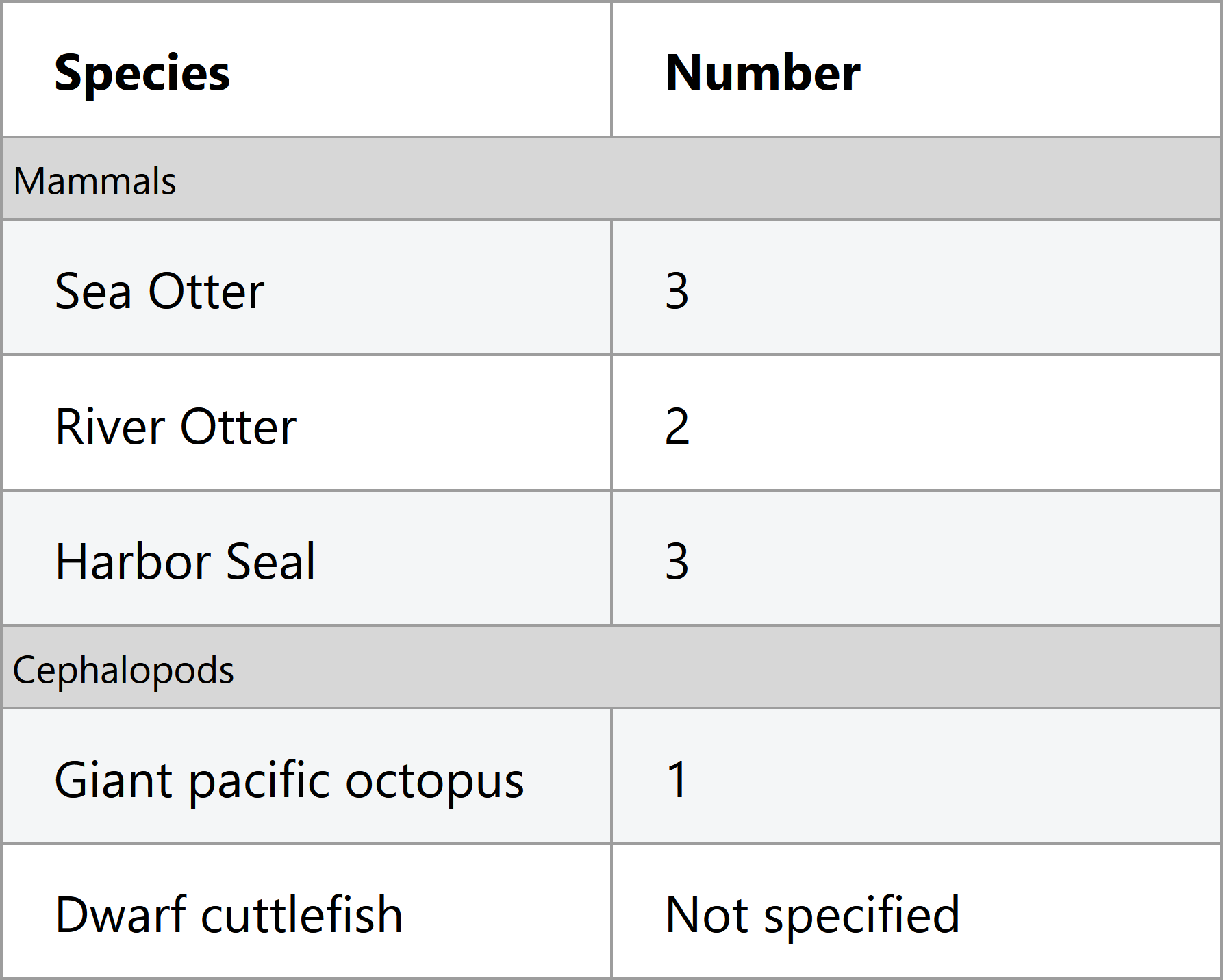
Sometimes column headers and row headers span multiple columns or rows, such as in this table:
If you are using table elements, the colspan and rowspan attributes have you covered. These work even if you are using ARIA to re-assert role="columnheader" or role="rowheader".
If, however, you are using <div>s or other non-table elements, the aria-colspan and aria-rowspan correspond directly to the colspan and rowspan attributes.
Miscellaneous other table and grid ARIA
We've covered all the table- and grid-specific ARIA attributes, but there are some others you might find useful, perhaps along with a good overview of ARIA labels and descriptions:
aria-labeloraria-labelledbyon the table or grid element: these corresond to using the<caption>element in an HTML<table>, and are a good idea to use to name the table or grid, particularly if there is more than one table or grid in the page.aria-describedbyon the table or grid element: if you want to associate a longer supplementary description in addition to the namearia-labeloraria-labelledbyon the rowgroup element: if you have multiple rowgroups in the table body, adding a name to each is a good ideaaria-activedescendanton the grid element (not on tables): we'll go over this in the next article on keyboard interaction
There are other supported attributes that I'm not going to cover that are purely use-at-your-own risk, like aria-selected on gridcells. Only use those if you're really sure you know what you're doing.
If you've made a habit of reading the supported attributes table in the ARIA spec, you may have noticed that rows support the following attributes:
aria-expandedaria-levelaria-posinsetaria-setsize
These are a bit of a gotcha "supported" status in the ARIA spec, since they're only supported on rows within treegrids, and are not supported in either grids or tables. For more on treegrids, see the next section.
Treegrids
Not today, Satan.
Wrap-up and further reading
Table and grid semantics are... not simple, clearly. The regular old been-around-the-block <table>, <tr>, and <td> elements do a lot of heavy lifting under the hood. There could easily be another article's worth of information on how all of this translates to accessibility APIs, if one wanted to really get in the weeds.
I used the NVDA screen reader for the recorded demos, but all Windows screen readers have very similar table interactions (they even all use Ctrl + Alt + arrow keys). VoiceOver on macOS uses different keyboard interactions, but also presents row and column information. You can try out the demos (plus a few other examples) with a screen reader of your choice on the grid semantics demo page.
This article and the previous one have focused about equally on both tables and grids. The next article on keyboard interaction will focus solely on grids, and hopefully be finished a bit faster than this article's 6-month time frame.
Finally, more eloquent people have already written about table semantics in different and helpful ways. Here are some of those articles:
- Data table design pattern - Heydon Pickering
- A practical example of fixing a broken table with ARIA - Steve Faulkner
- Tables, CSS Display Properties, and ARIA - Adrian Roselli (he also has other worthwhile articles related to table semantics on his site)
- A practical example of creating a semantic table in SVG - Léonie Watson